IOTConX: Brand Identity for Complex Connectivity
The project focused on creating a visual identity and website that communicates trust, technical competence, and readiness for what's next.
Service
Logo Design, Website Design
The Challenge
The IoT market is crowded and visually repetitive. Most platforms use the same tired symbols — abstract waves, generic network diagrams, glowing nodes. IoTConX needed a logo and website that felt technical and credible without being complicated or intimidating. Something that works for both the engineer evaluating integration and the executive approving the budget. The brand had to communicate connection, trust, and scalability immediately — not after a demo or a white paper.


How We Approached It
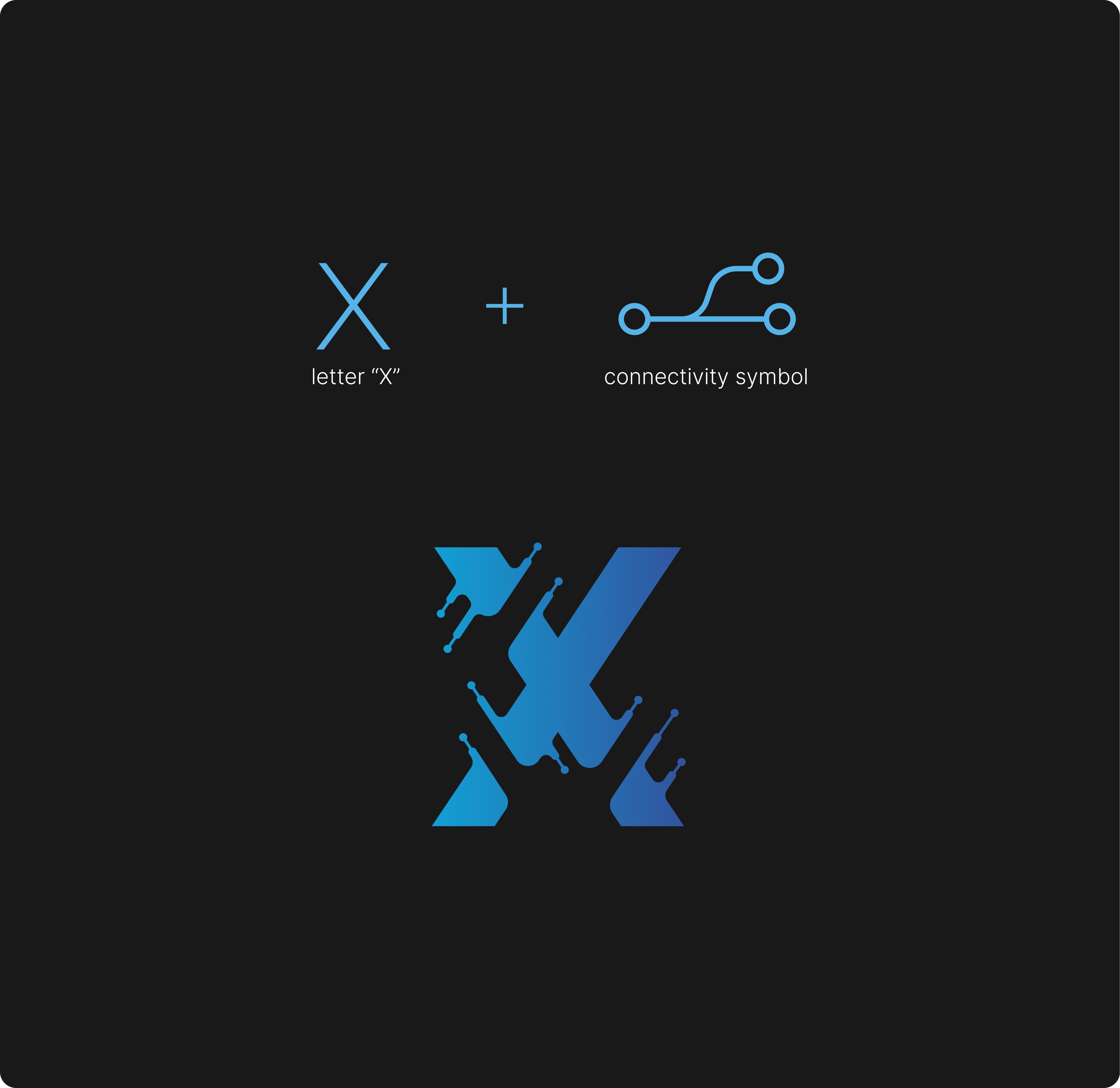
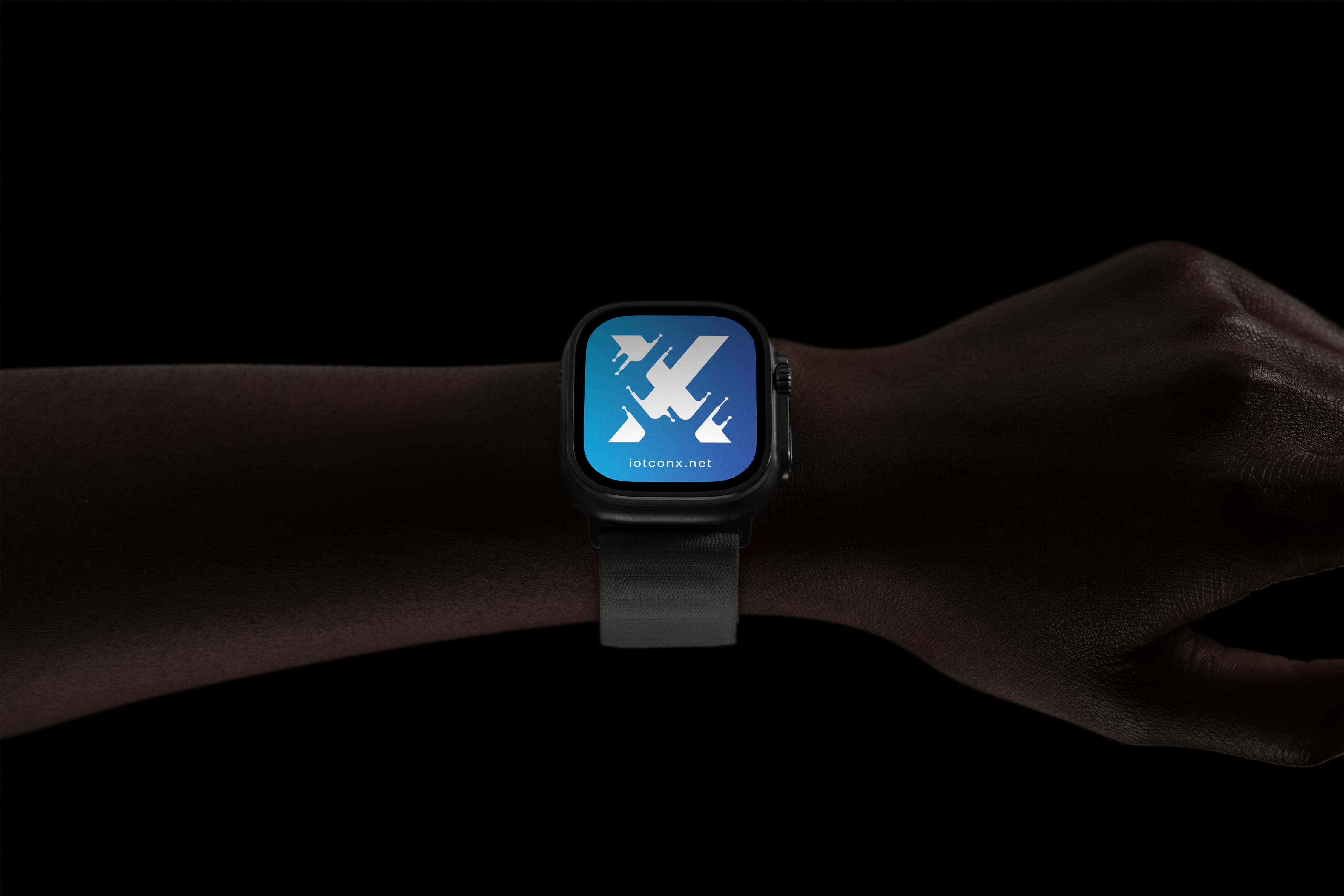
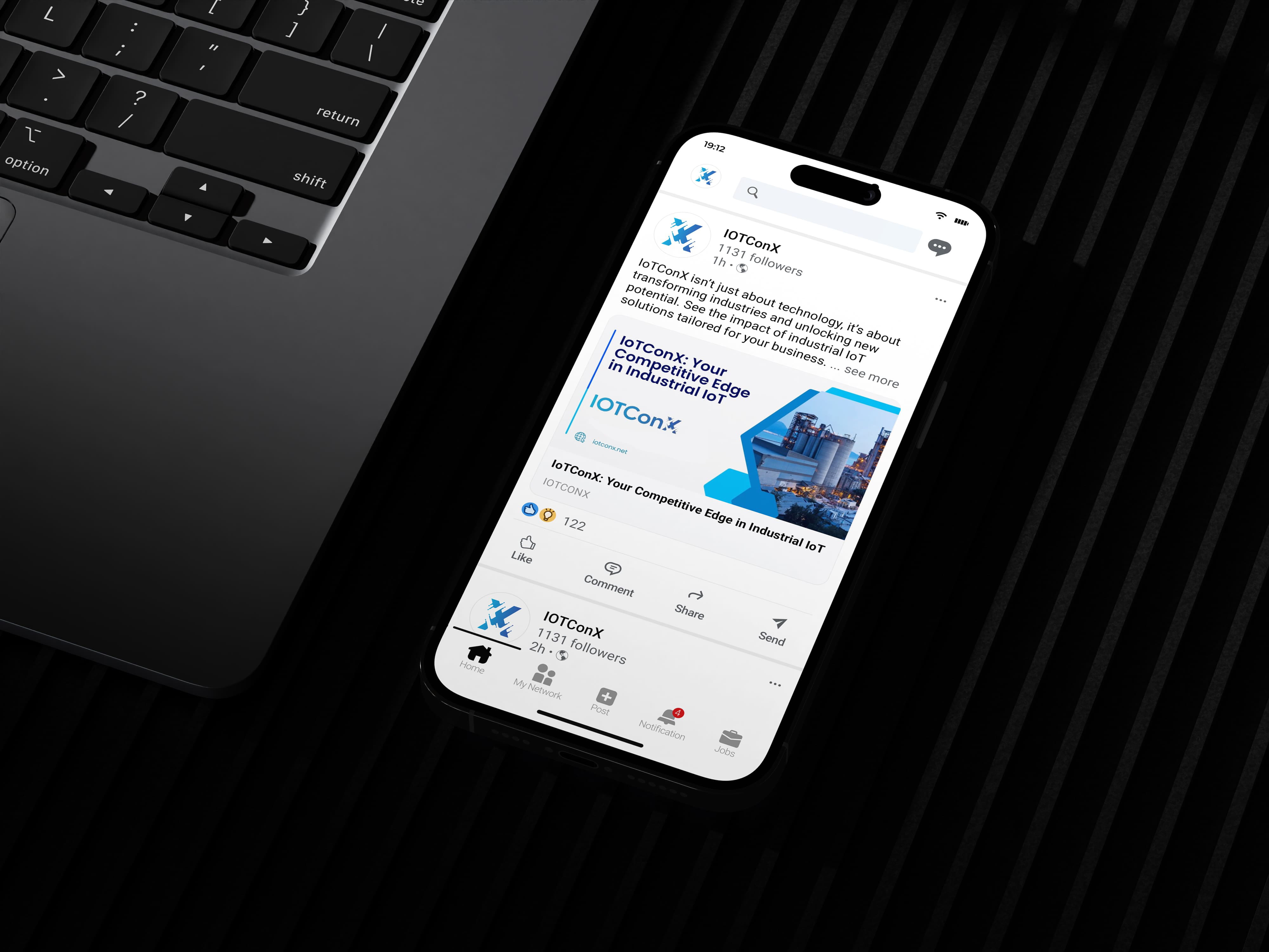
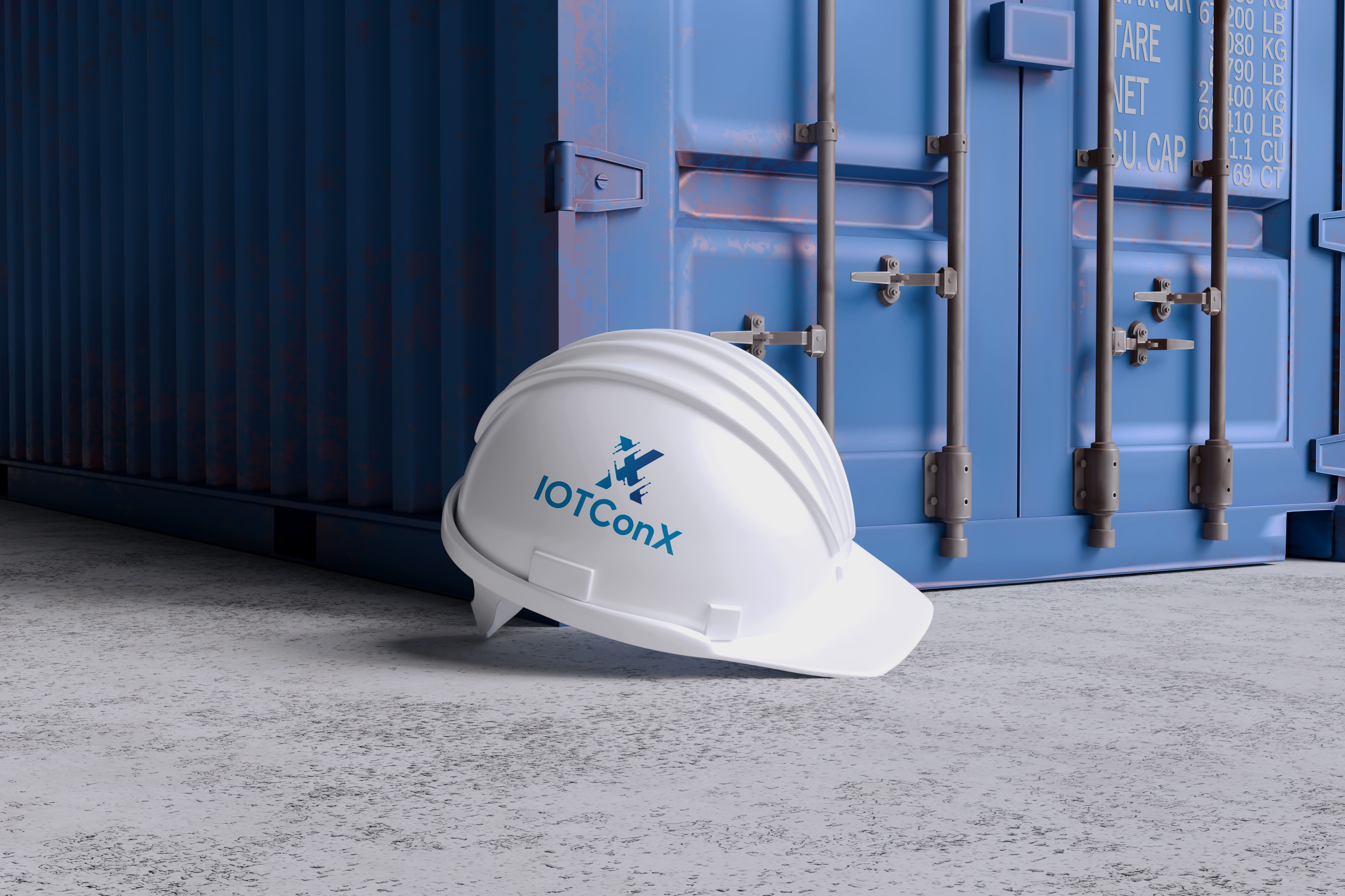
The company had solid technology but needed a visual identity that could carry its value proposition into first impressions. We built the logo around the letter "X" — the literal and conceptual center of the brand. The X represents the point where systems, devices, and data meet. It reflects controlled data flow, integration, and stability within complex IoT environments. The website follows the same principle. Layout, spacing, and hierarchy do the work. We reduced visual noise so structure and messaging could lead. Every section guides users through the platform's value with clarity and purpose, not clever interactions or unnecessary flourish.
The Result
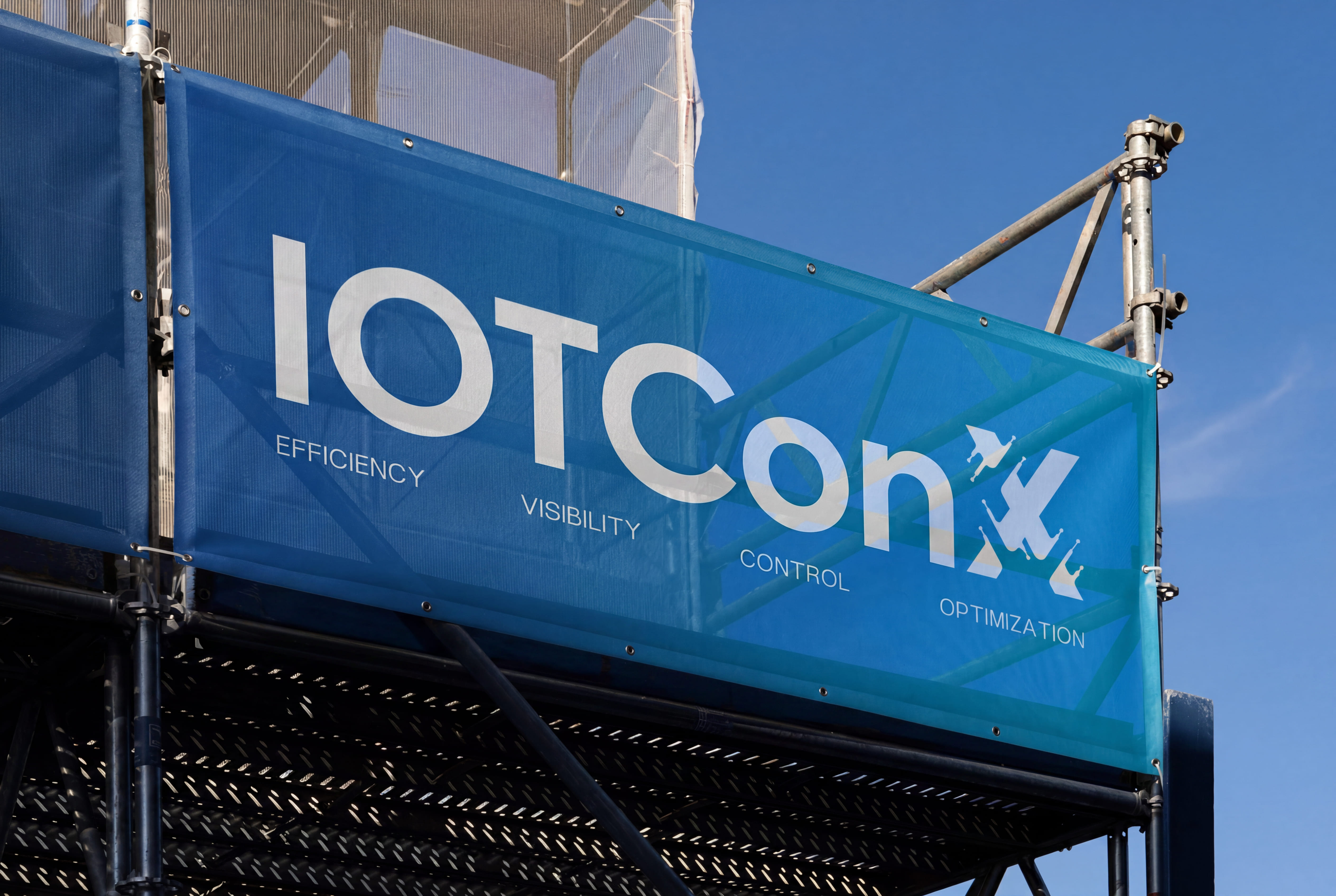
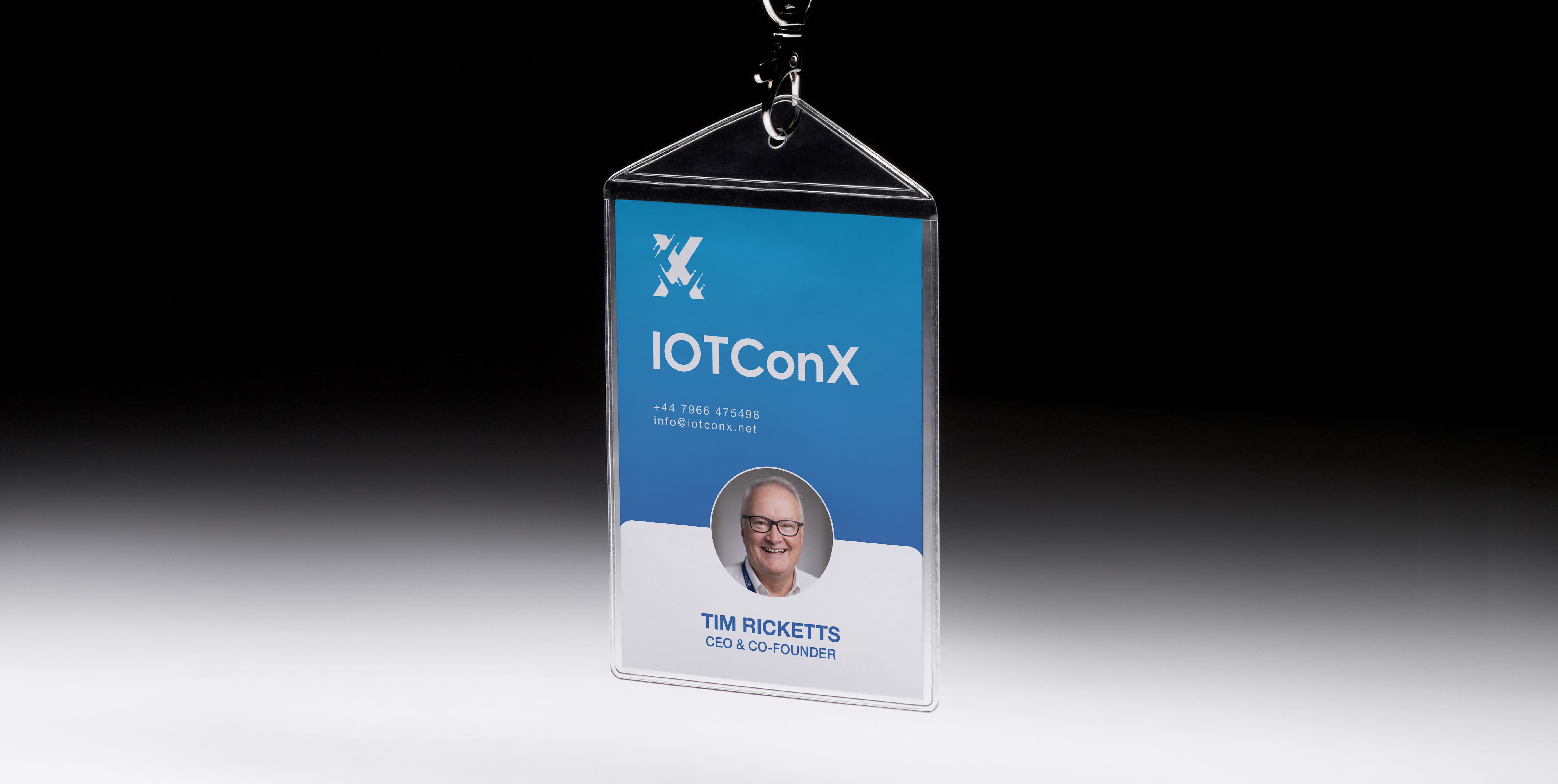
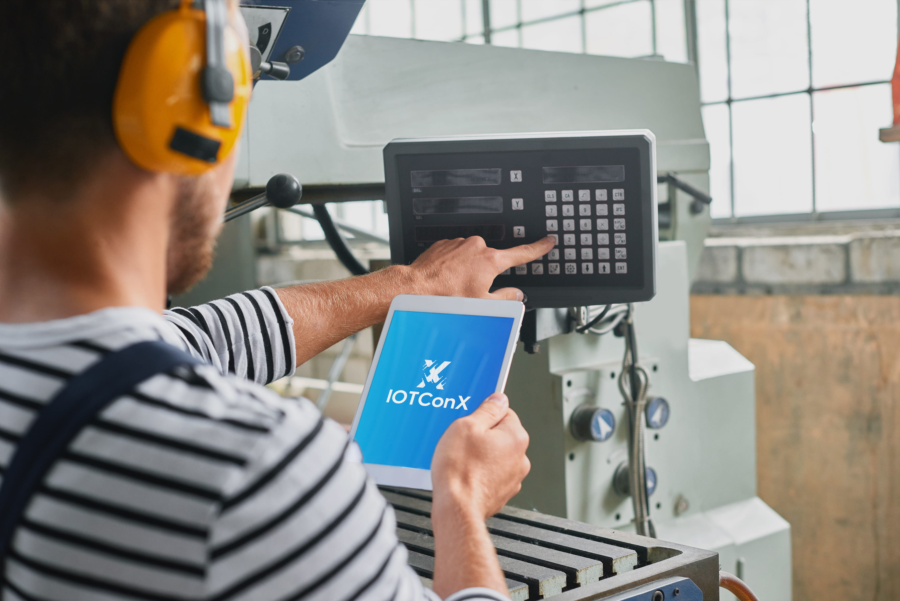
A clean identity and website that position IoTConX as a reliable platform built for real-world IoT deployment. The logo works across every touchpoint — from product interfaces to partner presentations. It's flexible, recognizable, and tied directly to what the platform does. The website translates a complex technical offering into a structured narrative that's easy to follow. It establishes trust, improves first impressions, and helps decision-makers understand how IoTConX fits into modern IoT architectures without requiring a technical background. It's the kind of identity that doesn't try to impress — it just works.

IOTConX: Brand Identity for Complex Connectivity
The project focused on creating a visual identity and website that communicates trust, technical competence, and readiness for what's next.
Service
Logo Design, Website Design
The Challenge
The IoT market is crowded and visually repetitive. Most platforms use the same tired symbols — abstract waves, generic network diagrams, glowing nodes. IoTConX needed a logo and website that felt technical and credible without being complicated or intimidating. Something that works for both the engineer evaluating integration and the executive approving the budget. The brand had to communicate connection, trust, and scalability immediately — not after a demo or a white paper.
How We Approached It
The company had solid technology but needed a visual identity that could carry its value proposition into first impressions. We built the logo around the letter "X" — the literal and conceptual center of the brand. The X represents the point where systems, devices, and data meet. It reflects controlled data flow, integration, and stability within complex IoT environments. The website follows the same principle. Layout, spacing, and hierarchy do the work. We reduced visual noise so structure and messaging could lead. Every section guides users through the platform's value with clarity and purpose, not clever interactions or unnecessary flourish.
The Result
A clean identity and website that position IoTConX as a reliable platform built for real-world IoT deployment. The logo works across every touchpoint — from product interfaces to partner presentations. It's flexible, recognizable, and tied directly to what the platform does. The website translates a complex technical offering into a structured narrative that's easy to follow. It establishes trust, improves first impressions, and helps decision-makers understand how IoTConX fits into modern IoT architectures without requiring a technical background. It's the kind of identity that doesn't try to impress — it just works.


